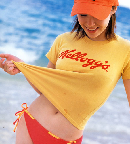
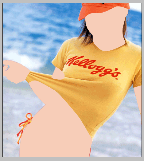
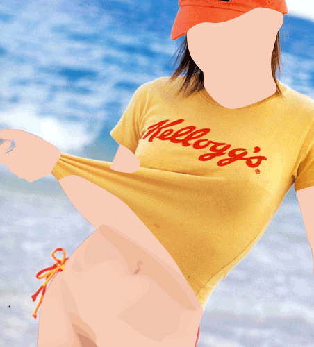
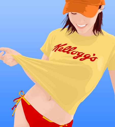
First right click on this image and save it on your desktop and open it on photoshop
Duplicate the current layer by pressing CTRL+J then go to Image>Adjustment>Posterize. Type 7 in the levels input box.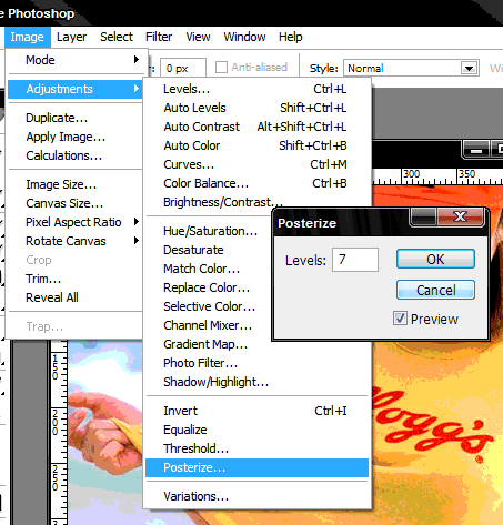
The posterized layer will serve as a guide to the shades of color that we need to trace. The higher the level of posterizing you use the more realistic your vector will look but it will also be more difficult to work on.
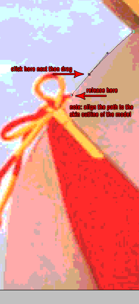
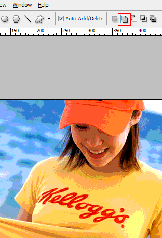
Now press F to go into fullscreen mode, this will make tracing shapes easier. Zoom in at around 300% using the zoom tool, then hold down the space bar (your cursor will change to a hand) click and drag the image so that you are looking at the part of the picture same as below.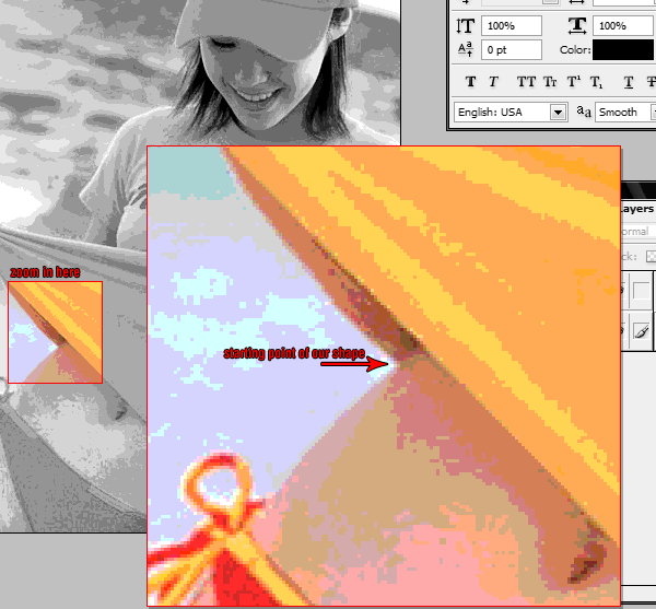
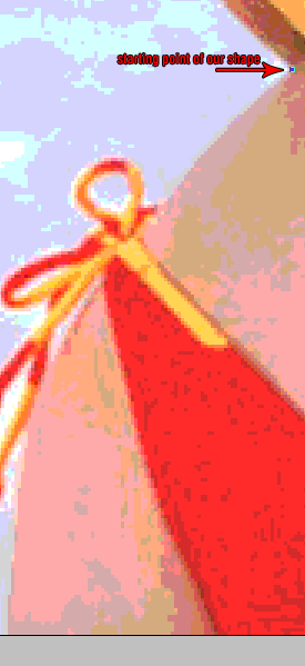
Click on the background layer to activate it then press P to select the pen tool, using the above image as a reference click on the starting point. You will notice that a new layer is created named “Shape 1″ on the Layers Palette. That is normal and this simply means that we are working on a vector shape. Follow the guide below to start tracing the outline of the skin of the model in the picture.
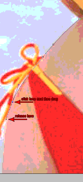
You may notice that I intentionally placed a node outside the picture, you don’t have to worry about this because any nodes outside the picture will not show and will not affect the vector. Also, in case you made a mistake or the curved path did not fit well you can hit CTRL+Z to undo. You can also edit any past node by holding the CTRL button and drag any node that you want to edit.
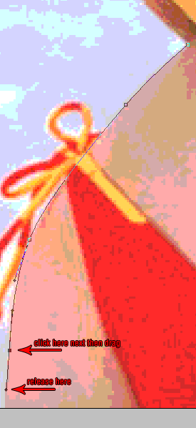
Continue tracing the shape until you have something like the image below:
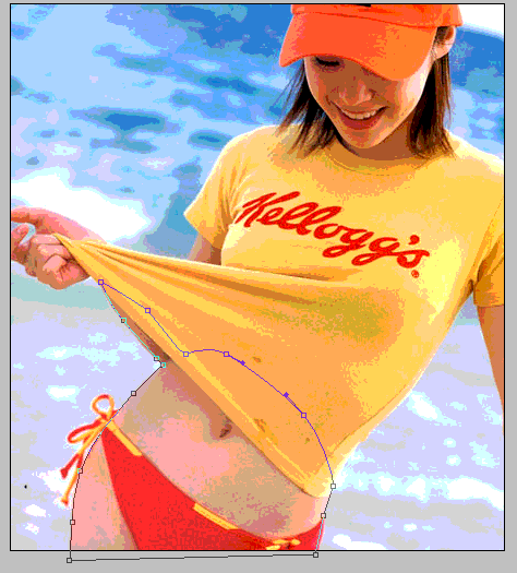
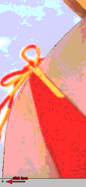
What we are doing here is to trace first all the skin parts. Finish tracing the belly and the leg part, don’t forget to close you shape. Click on the “add to shape area” on the shape options.
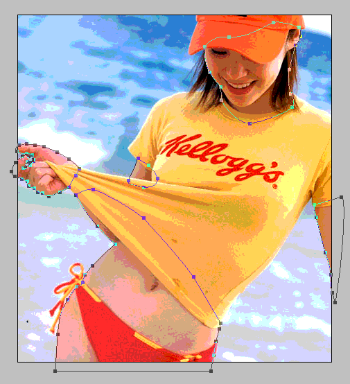
What this does is to add the next vector shape in the same layer. This way we can keep our layer organized and easier to edit in case we need to come back and correct something. Continue tracing the other skin shapes so you may end up with something like this:
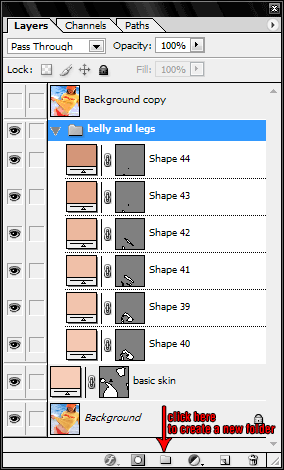
And this is what your layers palette should look like:
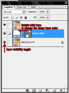
The top layer is your posterized picture, the middle layer is the shape layer which ou are working on and the bottom layer is the original picture. You can toggle on and off a layer by clicking on the layer visibility toggle icon. You can turn off the top layer so you can see how are you doing with your vector. Double click the box found on the left side of you shape layer to change its color. Select a color that is close to the primary skin color of our model (I used #F7CDB8). This will be the basic skin color of our vector, you will add highlights and shadows later to this to finish the vector skin.
Here’s what your current work should look like with the posterized layer turned off:
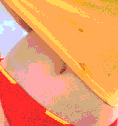
Using the posterized layer as a guide, we’ll start tracing shapes that will be details of our model’s skin. Lets concentrate on the belly and leg part first. When you posterized your picture’s color depth was reduced and the boundaries of the shades are shown. Take a look at the image below, it is a zoomed in picture of the posterized belly part. You’ll just have to trace every color that you see in this picture.
This is where you’re going to need the patience part. It really takes awhile to finish a vector portrait. You can also see clearly which color is on top of other color. Basically darker shades should be on top of a lighter shade. Every color shade must also have its own shape layer. You can create a new shape layer by clicking on create a new shape layer option in the shape tools option box. Don’t forget to use the add to shape area option to add a new shape in the current shape layer. The following thumbs are arrange in order in which they are created with the last thumb as the top most layer.
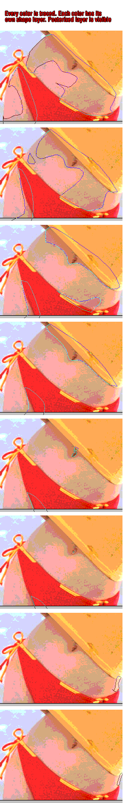
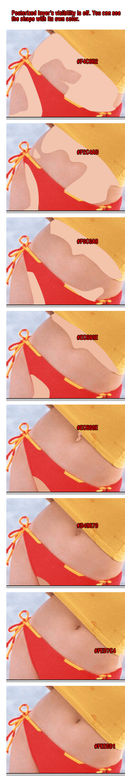
You will notice that each color shades have a very slight difference. Also the last 3 frames are actually highlights. I usually trace highlights after I work on the darker shades. Color are selected by moving the color selector slightly towards the darker side of the color palette or lighter side of the palette, depending if you’re working on shadows or highlights. Here’s what it looks like when its put all together:
Notice the details that are showing on the belly part of the skin. Using the same techniques, continue working on the shading and highlights for the other skin parts. You can organize your layers using the layer folders found on the layer palette. I highly recommend that each part should have its own folder.
Simply drag a layer to the folder that you created to include it in that set. Also, mind your layer arrangement. After you finished working on the other skin parts, here’s what you should have by now.
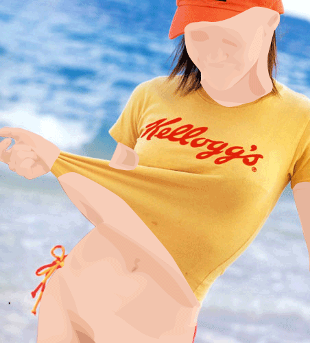
This is with the posterized layer off and the background layer on. Click on the link below to proceed with the tutorial.
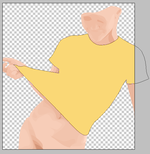
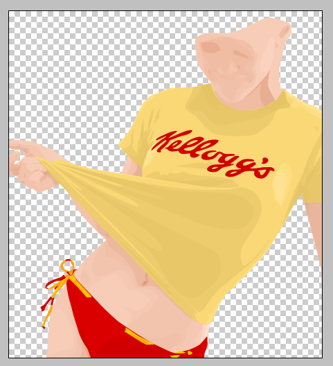
Now that we are finished with the skin, it’s time we do the clothes. Using the same techniques on tracing the skin, it’s going to be the same with the clothes and even easier. Using the pen tool and create a new shape layer and trace around the yellow top. This is how it should look like after you trace the shape of the yellow top.
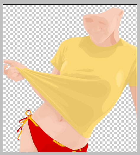
Once you get a hang of it and if you finished tracing the skin and its shadows and highlights, you won’t have a hard time tracing the shirt. The red bikini is also made on a different shape layer so as the string design for the bikini. Here’s what it should look like.
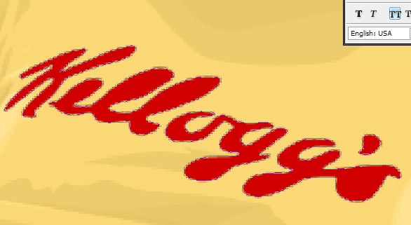
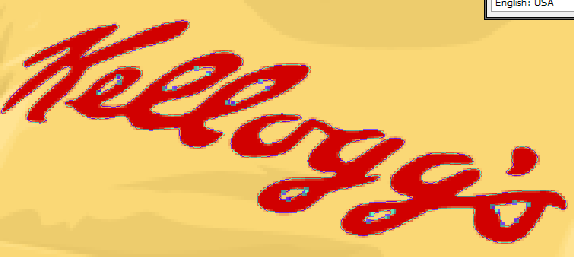
You can really see now the details of what we have been working on. Now the only thing missing is the word “Kellogg’s” on the shirt. Just trace the shape of the word as usual and don’t worry about the holes on “e”, “o”, “gg” and “s” yet.
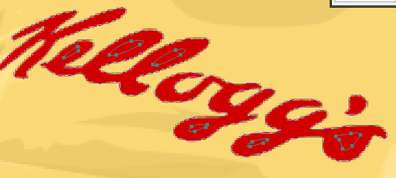
On the same shape layer trace the holes of the letters.
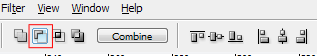
After tracing all the holes, use the path selection tool to select all the holes that you made for the letter then click on the subtract from shape area option on your shape options tool box.
This will make the hole paths negative thus becoming a hole on the word. Check it out.
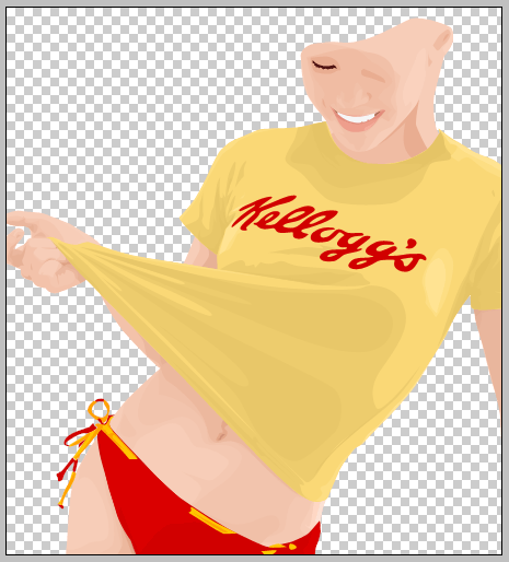
After that we can add the facial details and the hair and we’re almost done. This is how your work should look like by now.
Move on now to the next page for the facial details, hair and the baseball cap.
Now we will work on the details for the face, the hair and the baseball cap. Again, once you really get a hang of this it’ll be easy for you to work on any picture. Its just a matter of how much details you’d want to put into the portrait. First we’ll work on the eyes, actually just the right eye. As you might have noticed our model is looking and down so not much details will be needed for her eye.
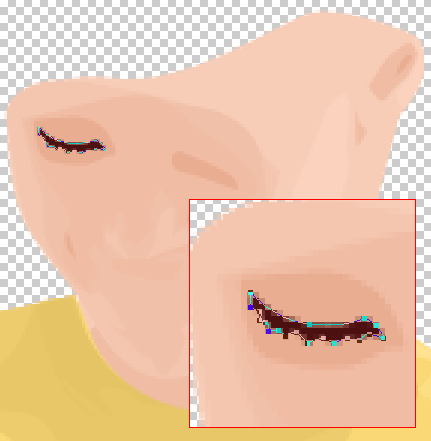
That’s it were done with the eye. Check out the image below of other eyes that I worked on from my other vectors.
You might notice that I do’t put much details on the eyes of my works but don’t let that stop you. You can put a lot of details when you’re working on your own vectors.
To trace the mouth, first trace the shape of the lips. Don’t forget the whole for the mouth, use the steps that we did when tracing the word “Kellogg’s” on her shirt.
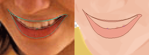
Using the posterized layer as a guide, add shadows and highlights on the lips.
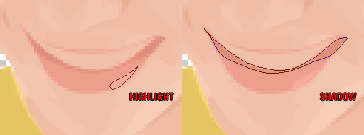
The color changes are subtle but when you look at the portrait the details really makes difference.
For the teeth, create a shape layer under the lips layer and fill it up with white then add the shadows to complete the mouth.
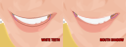
The mouth shadow layer is sandwich between the teeth and the lips layers. Here’s what our face currently looks like.
We now move on to the hair. The hair layer should be done on top of the skin layers. Just trace the hair as you normally would. Try to include the as much of the fly away strands as you can.
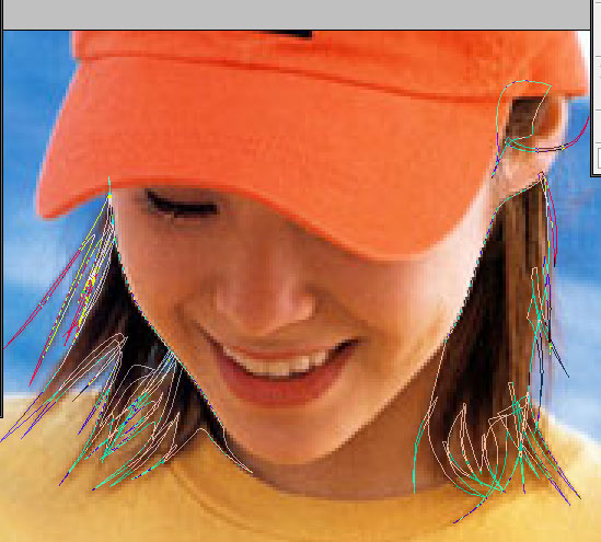
Here’s what it should look like with the original photo layer turned off:
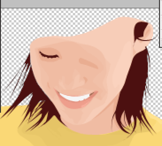
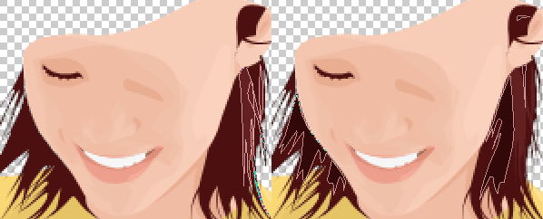
We need to add shadows and highlights to the hair to give it texture and not flat.
We’re don with the hair. Here’s what should our work should look like now.
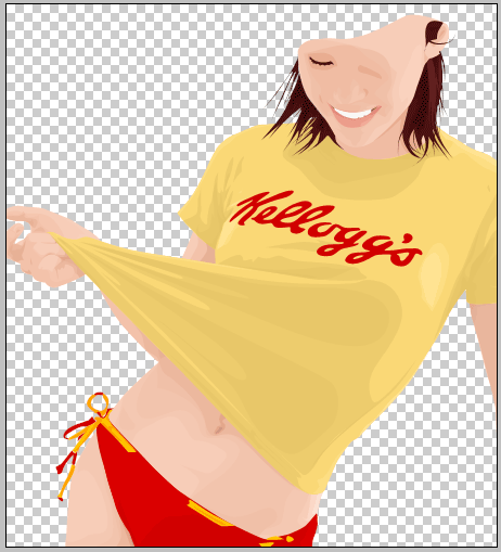
Now just finish it off with the baseball cap and create a background and you’re done.
If you need the reference psd for this tutorial you can download it from here.
I really hope that his tutorial was able to teach you what you needed to learn to work on your own vector portrait. Please do visit our gallery section to view more samples and submit any vector that you worked on using this tutorial. You may also email me for clarification or any suggestion on improving this tutorial.
Lastly, let me be the first to say Congratulations on your first vector!
Duplicate the current layer by pressing CTRL+J then go to Image>Adjustment>Posterize. Type 7 in the levels input box.
The posterized layer will serve as a guide to the shades of color that we need to trace. The higher the level of posterizing you use the more realistic your vector will look but it will also be more difficult to work on.
Now press F to go into fullscreen mode, this will make tracing shapes easier. Zoom in at around 300% using the zoom tool, then hold down the space bar (your cursor will change to a hand) click and drag the image so that you are looking at the part of the picture same as below.
Click on the background layer to activate it then press P to select the pen tool, using the above image as a reference click on the starting point. You will notice that a new layer is created named “Shape 1″ on the Layers Palette. That is normal and this simply means that we are working on a vector shape. Follow the guide below to start tracing the outline of the skin of the model in the picture.
You may notice that I intentionally placed a node outside the picture, you don’t have to worry about this because any nodes outside the picture will not show and will not affect the vector. Also, in case you made a mistake or the curved path did not fit well you can hit CTRL+Z to undo. You can also edit any past node by holding the CTRL button and drag any node that you want to edit.
Continue tracing the shape until you have something like the image below:
What we are doing here is to trace first all the skin parts. Finish tracing the belly and the leg part, don’t forget to close you shape. Click on the “add to shape area” on the shape options.
What this does is to add the next vector shape in the same layer. This way we can keep our layer organized and easier to edit in case we need to come back and correct something. Continue tracing the other skin shapes so you may end up with something like this:
And this is what your layers palette should look like:
The top layer is your posterized picture, the middle layer is the shape layer which ou are working on and the bottom layer is the original picture. You can toggle on and off a layer by clicking on the layer visibility toggle icon. You can turn off the top layer so you can see how are you doing with your vector. Double click the box found on the left side of you shape layer to change its color. Select a color that is close to the primary skin color of our model (I used #F7CDB8). This will be the basic skin color of our vector, you will add highlights and shadows later to this to finish the vector skin.
Here’s what your current work should look like with the posterized layer turned off:
Using the posterized layer as a guide, we’ll start tracing shapes that will be details of our model’s skin. Lets concentrate on the belly and leg part first. When you posterized your picture’s color depth was reduced and the boundaries of the shades are shown. Take a look at the image below, it is a zoomed in picture of the posterized belly part. You’ll just have to trace every color that you see in this picture.
This is where you’re going to need the patience part. It really takes awhile to finish a vector portrait. You can also see clearly which color is on top of other color. Basically darker shades should be on top of a lighter shade. Every color shade must also have its own shape layer. You can create a new shape layer by clicking on create a new shape layer option in the shape tools option box. Don’t forget to use the add to shape area option to add a new shape in the current shape layer. The following thumbs are arrange in order in which they are created with the last thumb as the top most layer.
You will notice that each color shades have a very slight difference. Also the last 3 frames are actually highlights. I usually trace highlights after I work on the darker shades. Color are selected by moving the color selector slightly towards the darker side of the color palette or lighter side of the palette, depending if you’re working on shadows or highlights. Here’s what it looks like when its put all together:
Notice the details that are showing on the belly part of the skin. Using the same techniques, continue working on the shading and highlights for the other skin parts. You can organize your layers using the layer folders found on the layer palette. I highly recommend that each part should have its own folder.
Simply drag a layer to the folder that you created to include it in that set. Also, mind your layer arrangement. After you finished working on the other skin parts, here’s what you should have by now.
This is with the posterized layer off and the background layer on. Click on the link below to proceed with the tutorial.
Now that we are finished with the skin, it’s time we do the clothes. Using the same techniques on tracing the skin, it’s going to be the same with the clothes and even easier. Using the pen tool and create a new shape layer and trace around the yellow top. This is how it should look like after you trace the shape of the yellow top.
Once you get a hang of it and if you finished tracing the skin and its shadows and highlights, you won’t have a hard time tracing the shirt. The red bikini is also made on a different shape layer so as the string design for the bikini. Here’s what it should look like.
You can really see now the details of what we have been working on. Now the only thing missing is the word “Kellogg’s” on the shirt. Just trace the shape of the word as usual and don’t worry about the holes on “e”, “o”, “gg” and “s” yet.
On the same shape layer trace the holes of the letters.
After tracing all the holes, use the path selection tool
to select all the holes that you made for the letter then click on the subtract from shape area option on your shape options tool box.This will make the hole paths negative thus becoming a hole on the word. Check it out.
After that we can add the facial details and the hair and we’re almost done. This is how your work should look like by now.
Move on now to the next page for the facial details, hair and the baseball cap.
Now we will work on the details for the face, the hair and the baseball cap. Again, once you really get a hang of this it’ll be easy for you to work on any picture. Its just a matter of how much details you’d want to put into the portrait. First we’ll work on the eyes, actually just the right eye. As you might have noticed our model is looking and down so not much details will be needed for her eye.
That’s it were done with the eye. Check out the image below of other eyes that I worked on from my other vectors.
You might notice that I do’t put much details on the eyes of my works but don’t let that stop you. You can put a lot of details when you’re working on your own vectors.
To trace the mouth, first trace the shape of the lips. Don’t forget the whole for the mouth, use the steps that we did when tracing the word “Kellogg’s” on her shirt.
Using the posterized layer as a guide, add shadows and highlights on the lips.
The color changes are subtle but when you look at the portrait the details really makes difference.
For the teeth, create a shape layer under the lips layer and fill it up with white then add the shadows to complete the mouth.
The mouth shadow layer is sandwich between the teeth and the lips layers. Here’s what our face currently looks like.
We now move on to the hair. The hair layer should be done on top of the skin layers. Just trace the hair as you normally would. Try to include the as much of the fly away strands as you can.
Here’s what it should look like with the original photo layer turned off:
We need to add shadows and highlights to the hair to give it texture and not flat.
We’re don with the hair. Here’s what should our work should look like now.
Now just finish it off with the baseball cap and create a background and you’re done.
If you need the reference psd for this tutorial you can download it from here.
I really hope that his tutorial was able to teach you what you needed to learn to work on your own vector portrait. Please do visit our gallery section to view more samples and submit any vector that you worked on using this tutorial. You may also email me for clarification or any suggestion on improving this tutorial.
Lastly, let me be the first to say Congratulations on your first vector!


