Saturday, July 16, 2011

Disign a poster In Photoshop and Illustrator

Design a Sin City Style Poster

Sin City was a really cool movie, at least visually. I really liked the stylish scenes and colors. A few months ago I saw a poster of another Frank Miller movie called "The Spirit." The poster is titled "My City Screams." It really caught my attention because of the way the design played with typography to recreate buildings. Also, the perspective was really well done.
In this tutorial, I’ll show you how to create that effect in Photoshop, but this time we’ll use Illustrator to create the perspectives and text. I’ll walk through the process of creating the effect; However, it’s always good if you play around and test different settings to see how it works. That for me is the best way to learn.
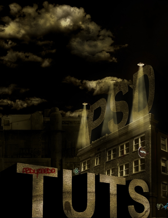
Final Image Preview

Final Click

Step 1

Create a new document in Photoshop, use 1000 pixels by 1300 pixels. Fill the background layer with black, and we’re ready to get our hands dirty.
Sin City Style Poster in Photoshop

Step 2

We’ll use Illustrator to create the text in the correct perspective. It’s better because we’ll need a huge area to place the vanishing points. Once in Illustrator, place the building’s image in the document. You can find it at this link. Then select the Line Segment Tool (\) and create a line following the perspective of the building. We’ll need two lines because when they cross is where our vanishing point will be located.
Sin City Style Poster in Photoshop

Step 3

Now that we have the vanishing point, it’s easy to create more lines. You can do that one by one or use the Blend Tool. I used the Blend Tool. Just rotate the top line keeping the pivot point on the vanish point. Make it much higher than the building because there will be text on the top. After that, just repeat the same procedure to find another vanish point, the vertical one. You will need these two only. However, if you want you could find the third one, the one on the right.
Sin City Style Poster in Photoshop

Step 4

With our grid done, it’s easy to apply the correct perspective to anything you want. Let’s type the text "PSD," and place it on top of the building. Then go to Object > Envelop Distort > Make with Mesh. Then change the Envelop Mesh settings to 1 Row and Column. After that, just move the vertices 1-4 using the grid for reference. The mesh will create curves, to avoid that just move the controls to follow the grid as well.
Sin City Style Poster in Photoshop

Step 5

Select the "PSD" text and go to Object > Expand and just click OK. Duplicate the "PSD" text, and move it to the bottom right, as in the image below. Then select the Blend Tool (W) and apply it to the two "PSD" texts. For the Blend Options use Specified Distance for the spacing with 4pt.
Sin City Style Poster in Photoshop

Step 6

Now type "TUTS,". Then go to Effect > 3D> Extrude & Bevel Options. This text has to go in the opposite direction from the "PSD" text. Instead of using the vanish lines we’ll use the 3D filter. Use the settings from the image below. Note that the values are: X = 6º, Y = -35º, Z = -3º, Perspective 51º, and the Extrude Depth is 288pt.
Sin City Style Poster in Photoshop

Step 7

Place the same image in our Photoshop document. After that, with the Magic Wand Tool (W) select and delete the blue sky. Then with the Polygonal Lasso Tool (L) let’s cut a part of the building so it will be the same width as the "PSD" text.
Sin City Style Poster in Photoshop

Step 8

Copy the "PSD" Blend from Illustrator. Then paste it on top and behind of the building. Then create a new layer, and select the Clone Stamp Tool(S). For the Stamp options change the Sample to All layers so you will be able to clone from all layers to the new one. However, we just want to clone the bricks part. You’ll need to fill the the "PSD" text with bricks.
Sin City Style Poster in Photoshop

Step 9

With the Magic Wand Tool(W) select the the dark part of the "PSD" blend and delete it. Leave just the front of the blend.
Sin City Style Poster in Photoshop

Step 10

Here let’s adjust the colors of the bricks. Select the "bricks" layer. Then go to Layer > New Fill Layer > Solid Color. Use #715b1f for the color and change the Blend Mode to Color. Then go to Layer > Creating Clipping Mask. After that, go to Layer > New Adjustment Layer > Hue&Saturation. Create a Clipping Mask again. Then change the values of the Hue&Saturations to Hue 0, Saturation -85, and Lightness -1.
Sin City Style Poster in Photoshop

Step 11

Now repeat the same procedure for the building layer, however use a different value for the Hue&Saturation, use Hue 0, Saturation -65, Lightness -43.
Sin City Style Poster in Photoshop

Step 12

Select the Pen Tool (P) and create a shape to cover the side of the building. Use the Shape Layers for the Pen Tool option, so you’ll be able to create a layer with a fill color. Use black for the fill and change the Blend Mode to Color Burn. Then go to Layer > Layer Mask > Reveal All. Then select the Brush Tool(B) with a regular brush with hardness 0. Then paint the mask with black so you’ll make the windows visible.
Sin City Style Poster in Photoshop

Step 13

Paste the "TUTS" text from Illustrator. Then get a bricks texture, you can download the one image I used. Basically, duplicate the texture, flip it horizontally, and move it to right. Repeat that to create a big rectangle. After that, go to Edit > Transform > Distort. Move the vertices to add a perspective. use the "TUTS" text as a reference.
Sin City Style Poster in Photoshop

Step 14

With the Magic Want Tool (W), select the front of the layer and the "TUTS" word only. Then with the bricks layer selected, go to Layer > Mask > Reveal Selection. After that, go Image > Adjustments > Hue & Saturation. For the settings, use Hue 0, Saturation -89, and Lightness -19.
Now go to Layer > New Fill Layer > Solid Color, use #16150b for the color. Then change the Blend Mode to Overlay with a 22% Opacity. The last thing here, select the >TUTS> word, not the brick layer, and go to Image > Adjustment > Levels. For the settings, use 86, 1, and 255.
Sin City Style Poster in Photoshop

Step 15

Create a new layer behind the >TUTS> layer. Then select the Brush Tool (B). Choose black for the color and a Brush with 0% Hardness. Then paint a shadow, as in the image below. Also, change the Layer Opacity to 90%.
Sin City Style Poster in Photoshop

Step 16

Let’s use another image, download this image and place it in the document behind all layers. It will be the background. Then grab the Polygonal Lasso Tool (L) and select that area with windows at the top of the image and delete it. Then go to Image > Adjustments > Hue/Saturation. For the settings, use Hue 0, Saturation -63, and Lightness -83. After that, go to Image > Desaturate.
Sin City Style Poster in Photoshop

Step 17

Now let’s add the Sky. You can download an image I took. Place it beneath all layers. Then change the Blend Mode to Hard Light at 55%. After that, go to Image > Adjustments > Levels. For the settings, use 16, 1.00, and 255. Then go to Layer > New Fill Color > Solid Color. Use #0f0d08 for the color and change the Blend Mode to Color.
Sin City Style Poster in Photoshop

Step 18

Download a lamp image. Delete the background using the Lasso Tool. Then go to Image > Adjustment > Desaturate. Then with the Brush Tool (B), create a new layer and paint a shadow as in the image below. Change the Opacity to 60% and use Color Burn for the Blend Mode.
Sin City Style Poster in Photoshop

Step 19

Place the Lamp image we have just edited. Then select the Pen Tool (P) and create a triangle (img. 1). Then go to Filter > Blur > Gaussian Blur. Use 3.5 for the amount. Then duplicate the layer. Just rotate it a little bit and move it the right (img. 2). After that duplicate the layer again. Place it between the two layers. Go to Filter > Blur > Gaussian Blur and use 4 for the amount this time.
Group the three layers and rename the group to "Rays." Then go to Layer > Layer Mask > Reveal All. Select the Gradient Tool (G) and use black and white for the colors. Use the Gradient Tool to fade out the light (img. 3)
Sin City Style Poster in Photoshop

Step 20

Group the "Lamp" layer with the "Rays" group. Then rename the new group to "Lamp." Then duplicate the group twice with resize and place them so we will have one on the "D," other on the "S," and the last one on the "P."
Sin City Style Poster in Photoshop

Step 21

On top of the other layers go to Layer > New Fill Layer > Solid Color. Use #292615 and change the Blend Mode to Saturation.
Sin City Style Poster in Photoshop

Step 22

Add a new layer, again on top of the others. Make sure you have black and white for the colors and go to Filter > Render > Clouds. Change the Blend Mode to Overlay and the Opacity to 90%. After that go to Image > Adjustments > Hue/Saturation. Select the Colorize option, and for the values use: Hue 53, Saturation 29, and Lightness -12.
Sin City Style Poster in Photoshop

Step 23

Add a new layer one more time and fill it with black. Then go to Filter > Noise > Add Noise. Use 10% for the amount and Gaussian for Distribution. After that, change the Blend Mode to Soft Light and the Opacity to 35%.
Sin City Style Poster in Photoshop

Step 24

Now you can add more details to the image, like some graffiti or signs, it’s up to you. Just remember to play with the Blend Modes and the order of the layers.
Sin City Style Poster in Photoshop

Conclusion

In this tutorial, we looked at different techniques to create 3D text and mix them with photos. Also, we created some textures using the Stamp Tool. The most important thing in this tutorial are the image adjustments. It’s really important when you create a design to manipulate different images of various colors. I hope you enjoy this tutorial as much as I did creating it.
Sin City Style Poster in Photoshop

Saturday, July 9, 2011

Metallic Sci-Fi Robot

Create a Metallic Sci-Fi Robot in Photoshop

  • Tutorial details

    Requirements
    Photoshop CS
    Difficulty
    Advanced
    Time
    3-10 Hours

  • Premium Content

    Project Files
    N/A


In this lesson you will learn how to create a futuristic looking Sci-Fi scene in Adobe Photoshop. We will use cool techniques to create abstract environments that add a great 3D depth. We will also turn a photo into a great looking metallic robot, so you should really take a look — seriously!
In this tutorial we are going to use the incredible zebra mask zentai P14 stock photo by mandylio.

Step 1

So, navigate to the stock photo linked above. Press Download to get it in high resolution. Open up the photograph on a separate layer in Photoshop, name the layer Original.

Step 2

Duplicate the Original layer, name it Working Copy – and work on this one from now on. Use the Brush Tool, the Clone Stamp Tool and the Smudge Tool to clean up some of the wrinkles (most obvious areas are marked in the figure).
This is not that important, but if you are going for a perfect look some work with this should really pay off in the end.

Step 3

Make sure the background is totally filled with black (still on the Working Copy layer). Use fills, brushes and selections to fill in the blacks.

Step 4

Now we will make a pattern/brush of this, so right-click the the Working Copy layer and select Duplicate Layer. Duplicate to a new document.

Step 5

Use the Lasso Tool to drag a selection around the head of our character. Fill the selection with black.

Step 6

Use the Crop Tool to crop the image so that it only shows the white shapes.
Note: I use a White shield color when using the Crop Tool here, the default color is Black (I changed it for visualization purposes).

Step 7

Convert the image to Grayscale (Image > Mode > Grayscale) – discard any color information if asked.
As we will convert this image to a pattern & brush, it is a good idea to clean up the edges so that it will not look square. Grab a black brush and start filling in where necessary.
Red = Black

Step 8

Sharpen the image a bit (Filter > Sharpen > Sharpen), then convert it into a pattern (Edit > Define Pattern). Name it something that you will remember later in this tutorial.
While you are at it, you might want to define a brush preset as well (Edit > Define Brush Preset) — the brush will not be used in this tutorial, though.

Step 9

Go back to the previous document. Add a new Black & White Adjustment Layer, then create a new layer Eye Fills.
Fill the character’s eyes with black. The reason why we put it on a separate layer is that we want to be able to toggle “eyes” or “no eyes” to see what looks the best later on.

Step 10

Go to the Channels window (Window > Channels), activate the Red Channel and load the channel as a selection.

Step 11

With the loaded selection still active, add a Solid Fill Layer (Layer > New Fill Layer > Solid Color) — select white as the fill color. Name the layer Character Lines.

Step 12

Now, before starting to work on the background it is practical to extend the canvas size a bit so that we have more room to work with. Go to Image > Canvas Size.

Step 13

Create a new layer Very Thin, then group it (Ctrl/Cmd + G) — name the group Lines.
Select the Pattern Stamp Tool. In the options for this tool, set the pattern to the pattern that we created earlier. Set the blending mode to Lighten and enable the Impressionist setting. Use a 1px soft brush to draw the first lines holding the head of our character.

Step 14

Create a new layer Thin, inside the Lines group. Set the brush size to 3px and continue to add some more lines, this time not only to the head — but also to the arms.

Step 15

Create a group named Abstract BG, then continue to add strokes of various width on each layer — this time in random directions (mind the pose of the character and try to mimic its direction).
Try to create a depth by stacking layers and using different sizes of the brush.
Switch off the Impressionist setting for the Pattern Stamp Tool to create sharper and more abstract shapes for the background.
Note: this tool works in mysterious ways. Have fun with it, use different sizes and short strokes from different directions and angles. Since the blending mode is set to lighten you will add shapes all the time, not remove — so do not be afraid to play around.
Lowering the opacity is a great trick here to create depth.
Create more layers, use the same technique to create more abstract elements. Scale up the layer apply a layer mask and remove unnecessary details. If your shapes loose quality when you scale up, you can use the Smudge Tool to smooth them up. Add some noise to the smudged parts to keep a sense realism.

Step 16

Now, to make the character blend in a bit better we are going to hide the Working Copy layer and modify the mask of the Character Lines layer.
Click the layer mask icon for the Character Lines layer, then select the Gradient Tool (G). Use a linear gradient (black color fading out to transparent), and drag from the bottom edge of the image to the chin of the character.
While doing the gradient I also used the Brush Tool to modify the shape of the head (drawing with black on the layer mask).

Step 17

I wanted the lines/strings to come from all directions, so to create this effect I still used the Pattern Stamp Tool with the same pattern — but I used a fade setting for the brush preset.
This will make the size of the brush fade by the length of the strokes.

Step 18

To add a bit of texture to the background you can go ahead and render some fibers on a new layer (Filter > Render > Fibers). Set the Blending Mode to Color Dodge and use Levels to balance the effect.
Add a layer mask to the layer and hide everything (fill it with black). Use a large brush at low opacity to show some of the details (white color). Then use a very small brush (range 5-10px) with “Scattering” turned on to make some glitter (still white color).

Step 19

At this stage I was not very happy with the looks of the character, so I put some more work into it. I wanted a more metallic feel, so I began by duplicating the Character Lines layer two times.
On the first copy I applied a Glowing Edges filter (Filter > Stylize > Glowing Edges) — renamed it Character Outlines.
On the second copy (placed below the first) I used a soft black brush to modify the Layer mask to mimic shadows & highlights.
I also used the Dodge & Burn Tool to modify shadow & highlights of some of the abstract background elements.

Step 20

Add just a small amount of noise if you feel your abstract elements need more texture and sharpness.

Step 21

Duplicate the Character Lines layer again, and modify the Layer mask to add shades to the face. I noticed that the face and the body needed some smoothing, so I went ahead and used the Smudge Tool on some parts of it. Determine your light source and mask Character Outlines accordingly.
I worked about 1 hour on this part, so do not stress it.

Step 22

If you zoom in the character’s left hand you will notice that there are some noise around it. Use a Layer mask or the Eraser Tool to clean this up.
This step takes a while to complete if you are going for perfection, but it’s good practice and the final result will look much sharper if you spend some time working on details like these.

Step 23

When you are happy with how the character looks, you can put all its layers in a group and continue working on the background.
To add some more depth, I went ahead and rendered some regular clouds — scaled them up 300% then scaled down only the height so that the clouds become more like fog. Used a regular Layer mask to remove some of the details.

Step 24

Now add a Curves Adjustment Layer to crank up the brightness and contrast just a little bit.
For the coloring I used Gradient Fill Layers with Blending Mode set to Color at 65% Opacity.
To colorize selective parts of the image, use Clipping Masks.

Step 25

If you want a more vivid and bright picture you can create a new layer on the top of your layer stack. Select a large soft brush at low opacity and click areas where you want light.
First add some yellow lights. Change the size of your brush to adjust the spread of the light, change the opacity of the brush to adjust the intensity of the light. Clicking once in the areas where you want light is enough (you do not have to stroke). You can also click multiple times to increase the intensity gradually.
Then add create a new layer and add some white lights using technique. You may also have to modify the Layer Masks of your background if it gets to bright.

Step 25

To brighten the already bright parts of the image you should add a Curves Adjustment Layer. This will raise the brightness and lower the darks, hence making the picture more eye catching.

Result