 View demo Download source
Today we will create a stunning full page photo wall gallery. The idea is to have a whole page full of thumbs with a nice light effect when we hover. When an image is clicked, a panel slides up from the bottom revealing the full picture. When clicking on the full image, the thumbs panel slide back from the bottom. This effect will give the impression that we are stacking the panels on top of each other every time we change the mode. In the full picture view we add some nice transition effect when we browse through the photos.
In addition, we will use a function for resizing the full image, adapting it to the size of the screen. So, when the screen get’s resized, our image will adapt automatically!
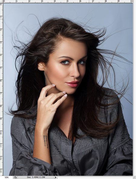
The beautiful images in the demo are from
Vincent Boiteau’s photostream on Flickr.
This tutorial will be a little bit more complex than usual, so I will give my best to explain things clearly.
Let’s get started with the markup.
The Markup
The HTML structure consists of three main containers: one for the info bar at the bottom of the page, one for the thumbnails and one panel container for the full image:
<div class="infobar">
	<span id="description"></span>
	<span id="loading">Loading Image</span>
</div>
<div id="thumbsWrapper">
	<div id="content" >
		<img src="thumbs/1.JPG" alt="images/1.JPG" title="something"/>
		<img src="thumbs/2.JPG" alt="images/2.JPG" title="something"/>
		...
		<div class="placeholder"></div>
	</div>
</div>
<div id="panel">
	<div id="wrapper">
		<a id="prev"></a>
		<a id="next"></a>
	</div>
</div>
The info bar container has a span for the image description and one for the loading display. The thumbnail wrapper contains a content container for all the small images. The very last element after the thumbnails is a placeholder. We need to add some space to the end because we don’t want the thumbnails to get covered by the info bar. Since we don’t want to use any paddings or margins in our containers, we simply add another filler element.
The structure for the panel contains a wrapper for the full image and two navigation items. In our JavaScript function we will add the full size image to this wrapper.
Now, let’s take a look at the style.
The CSS
First, we will define some general style for the page:
*{
    margin:0;
    padding:0;
}
body{
    background-color:#000;
    font-family:Verdana;
    text-transform:uppercase;
    color:#fff;
    font-size:10px;
    overflow:hidden;
}
The body needs to get the property overflow hidden, because we will set the scroll bar for the thumbs view only. If we would add scrolling to the page, the scroll bar would appear when the full image panel slides up. We avoid that by saying that the overflow will be hidden for the body.
The info bar will have a fixed position. We always want it to be visible and at the same place in the page:
.infobar{
    background-color:#000;
    height:28px;
    line-height:28px;
    right:20px;
    position:fixed;
    bottom:0px;
    left:20px;
    z-index:999999999;
    text-align:center;
    color:#ddd;
    -moz-border-radius:10px 10px 0px 0px;
    -webkit-border-top-left-radius:10px;
    -webkit-border-top-right-radius:10px;
    border-top-left-radius:10px;
    border-top-right-radius:10px;
    text-shadow:0px 0px 1px #ccc;
}
We add some border radius for rounded borders. We set the z-index crazily high since we want the element to be always on top. of course you could just use a value like 15 or 50. Just be careful with the other elements that will get a new z-index dynamically in the JS. The highest one of them is 10.
The description and the loading item will have the following style:
span#description{
    text-shadow:1px 1px 1px #000;
    display:none;
}
span#loading{
    display:none;
    padding-right: 30px;
    background:transparent url(../loading.gif) no-repeat center right;
}
The loading item will have a loading image as background.
The thumbs wrapper will have a panel like style. We set it fixed, occupying the whole screen.
Important for the effect is the bottom:0px since we will want the wrapper to come up from the bottom by animating its height. Again, we set the overflow to hidden, since we just want the content container to have a scroll bar.
#thumbsWrapper{
    overflow:hidden;
    position:fixed;
    height:100%;
    width:100%;
    left:0px;
    right:0px;
    bottom:0px;
}
The content wrapper will also occupy all the page. The vertical scroll bar we set explicitly by saying overflow-y:scroll (auto would be the default value). Initially, we want this container to be invisible because we don’t want to show the scroll bar while there is nothing on the page during the initial loading time.
#content{
   position:absolute;
   top:0px;
   height:100%;
   width:100%;
   left:0px;
   background-color:#111;
   overflow-y:scroll;
   display:none;
}
The images in the content container will float left and have an opacity of 0.4. The hover function will then increase opacity, giving the whole thing a spotlight effect.
#content img{
    float:left;
    margin:2px;
    cursor:pointer;
    opacity:0.4;
    filter:progid:DXImageTransform.Microsoft.Alpha(opacity=40);
}
The placeholder will make sure that our thumbs don’t get covered by the info bar when we are at the bottom of the page:
.placeholder{
    float:left;
    clear:both;
    width:100%;
    height:30px;
}
The panel will have the following style similar to the style of the thumbs wrapper:
#panel{
    background-color:#222;
    width:100%;
    position:fixed;
    bottom:0px;
    left:0px;
    right:0px;
    height:0px;
    text-align:center;
}
Initially, the
#panel img{
    cursor:pointer;
    position:relative;
    border:1px solid #000;
    -moz-box-shadow:0px 0px 10px #111;
    -webkit-box-shadow:0px 0px 10px #111;
    box-shadow:0px 0px 10px #111;
    display:none;
}
We set it to display:none since we will make it appear by fading it in. This will create a nice effect.
The image wrapper be centered horizontally. This we achieve by setting the left and right margins to auto.
#wrapper{
    position:relative;
    margin:40px auto 0px auto;
}
The navigation items will have the following style:
a#next,
a#prev{
    width:40px;
    height:40px;
    position:fixed;
    cursor:pointer;
    outline:none;
    display:none;
    background:#aaa url(../nav.png) no-repeat top left;
}
a#next:hover, a#prev:hover{
    background-color:#fff;
}
a#next{
    right:0px;
    top:50%;
    margin-top:-20px;
    background-position: 0px 0px;
}
a#prev{
    left:0px;
    top:50%;
    margin-top:-20px;
    background-position: 0px -40px;
}
We give the navigation items a fixed position.
To center an absolute or fixed element horizontally (or vertically) you can give it a top (or left) value of 50% and then a negative top (or left) margin of half of its height (or width). Since the navigation item is 40px high, our top margin is is -20px.
And that was all the style. Now, let’s take a look at the JavaScript magic:
The JavaScript
OK, don’t scare, it’s a bit lengthy… but don’t worry, most of it is comments and code indention :)
Our main functions fire when we click on a thumb or click on a full image.
When clicking on a thumbnail (line 34) we first show our loading item in the info bar. Then we say to load the respective image (line 40) with the source being the alt attribute of the thumb we clicked (line 92). Everything that is inside of the load function will just be executed after the image is loaded (line 41 to 93). So, we hide the loading item from the info bar, resize the image to fit into the viewport and append the image element to the wrapper. Then we fade it in (line 54) and slide up the panel where we will see the full image and the fading in effect still executing (57 – 91). We also show the description and the navigation items, and finally we make the thumbs wrapper disappear by setting the height to 0 (line 90). We do that because we want it sliding back from the bottom when we click on the full image.
For the click event on the full image (line 101 to 119) we need to use “live” since the img element is not there in the beginning but it is created dynamically. We animate the thumbs wrapper and set the panel to zero height.
The functions for browsing through the full images check which thumb image is the previous or next one and according to that we set the next or previous full image (line 128 to 137). For that we use the navigate function (line 143 to 191).
From line 18 to 26 we say that we want the full size picture to be resized whenever we resize the window. The resize function is defined from line 197 until 237. We also resize the wrapper around the image.
$(function() {
/* this is the index of the last clicked picture */
var current = -1;
/* number of pictures */
var totalpictures = $('#content img').size();
/* speed to animate the panel and the thumbs wrapper */
var speed = 500;
/* show the content */
$('#content').show();
/*
when the user resizes the browser window,
the size of the picture being viewed is recalculated;
*/
$(window).bind('resize', function() {
var $picture = $('#wrapper').find('img');
resize($picture);
});
/*
when hovering a thumb, animate it's opacity
for a cool effect;
when clicking on it, we load the corresponding large image;
the source of the large image is stored as
the "alt" attribute of the thumb image
*/
$('#content > img').hover(function () {
var $this = $(this);
$this.stop().animate({'opacity':'1.0'},200);
},function () {
var $this = $(this);
$this.stop().animate({'opacity':'0.4'},200);
}).bind('click',function(){
var $this = $(this);
/* shows the loading icon */
$('#loading').show();
$('![]() ').load(function(){
$('#loading').hide();
if($('#wrapper').find('img').length) return;
current = $this.index();
var $theImage = $(this);
/*
After it's loaded we hide the loading icon
and resize the image, given the window size;
then we append the image to the wrapper
*/
resize($theImage);
$('#wrapper').append($theImage);
/* make its opacity animate */
$theImage.fadeIn(800);
/* and finally slide up the panel */
$('#panel').animate({'height':'100%'},speed,function(){
/*
if the picture has a description,
it's stored in the title attribute of the thumb;
show it if it's not empty
*/
var title = $this.attr('title');
if(title != '')
$('#description').html(title).show();
else
$('#description').empty().hide();
/*
if our picture is the first one,
don't show the "previous button"
for the slideshow navigation;
if our picture is the last one,
don't show the "next button"
for the slideshow navigation
*/
if(current==0)
$('#prev').hide();
else
$('#prev').fadeIn();
if(current==parseInt(totalpictures-1))
$('#next').hide();
else
$('#next').fadeIn();
/*
we set the z-index and height of the thumbs wrapper
to 0, because we want to slide it up afterwards,
when the user clicks the large image
*/
$('#thumbsWrapper').css({'z-index':'0','height':'0px'});
});
}).attr('src', $this.attr('alt'));
});
/*
when hovering a large image,
we want to slide up the thumbs wrapper again,
and reset the panel (like it was initially);
this includes removing the large image element
*/
$('#wrapper > img').live('click',function(){
$this = $(this);
$('#description').empty().hide();
$('#thumbsWrapper').css('z-index','10')
.stop()
.animate({'height':'100%'},speed,function(){
var $theWrapper = $(this);
$('#panel').css('height','0px');
$theWrapper.css('z-index','0');
/*
remove the large image element
and the navigation buttons
*/
$this.remove();
$('#prev').hide();
$('#next').hide();
});
});
/*
when we are viewing a large image,
if we navigate to the right/left we need to know
which image is the corresponding neighbour.
we know the index of the current picture (current),
so we can easily get to the neighbour:
*/
$('#next').bind('click',function(){
var $this = $(this);
var $nextimage = $('#content img:nth-child('+parseInt(current+2)+')');
navigate($nextimage,'right');
});
$('#prev').bind('click',function(){
var $this = $(this);
var $previmage = $('#content img:nth-child('+parseInt(current)+')');
navigate($previmage,'left');
});
/*
given the next or previous image to show,
and the direction, it loads a new image in the panel.
*/
function navigate($nextimage,dir){
/*
if we are at the end/beginning
then there's no next/previous
*/
if(dir=='left' && current==0)
return;
if(dir=='right' && current==parseInt(totalpictures-1))
return;
$('#loading').show();
$('
').load(function(){
$('#loading').hide();
if($('#wrapper').find('img').length) return;
current = $this.index();
var $theImage = $(this);
/*
After it's loaded we hide the loading icon
and resize the image, given the window size;
then we append the image to the wrapper
*/
resize($theImage);
$('#wrapper').append($theImage);
/* make its opacity animate */
$theImage.fadeIn(800);
/* and finally slide up the panel */
$('#panel').animate({'height':'100%'},speed,function(){
/*
if the picture has a description,
it's stored in the title attribute of the thumb;
show it if it's not empty
*/
var title = $this.attr('title');
if(title != '')
$('#description').html(title).show();
else
$('#description').empty().hide();
/*
if our picture is the first one,
don't show the "previous button"
for the slideshow navigation;
if our picture is the last one,
don't show the "next button"
for the slideshow navigation
*/
if(current==0)
$('#prev').hide();
else
$('#prev').fadeIn();
if(current==parseInt(totalpictures-1))
$('#next').hide();
else
$('#next').fadeIn();
/*
we set the z-index and height of the thumbs wrapper
to 0, because we want to slide it up afterwards,
when the user clicks the large image
*/
$('#thumbsWrapper').css({'z-index':'0','height':'0px'});
});
}).attr('src', $this.attr('alt'));
});
/*
when hovering a large image,
we want to slide up the thumbs wrapper again,
and reset the panel (like it was initially);
this includes removing the large image element
*/
$('#wrapper > img').live('click',function(){
$this = $(this);
$('#description').empty().hide();
$('#thumbsWrapper').css('z-index','10')
.stop()
.animate({'height':'100%'},speed,function(){
var $theWrapper = $(this);
$('#panel').css('height','0px');
$theWrapper.css('z-index','0');
/*
remove the large image element
and the navigation buttons
*/
$this.remove();
$('#prev').hide();
$('#next').hide();
});
});
/*
when we are viewing a large image,
if we navigate to the right/left we need to know
which image is the corresponding neighbour.
we know the index of the current picture (current),
so we can easily get to the neighbour:
*/
$('#next').bind('click',function(){
var $this = $(this);
var $nextimage = $('#content img:nth-child('+parseInt(current+2)+')');
navigate($nextimage,'right');
});
$('#prev').bind('click',function(){
var $this = $(this);
var $previmage = $('#content img:nth-child('+parseInt(current)+')');
navigate($previmage,'left');
});
/*
given the next or previous image to show,
and the direction, it loads a new image in the panel.
*/
function navigate($nextimage,dir){
/*
if we are at the end/beginning
then there's no next/previous
*/
if(dir=='left' && current==0)
return;
if(dir=='right' && current==parseInt(totalpictures-1))
return;
$('#loading').show();
$('![]() ').load(function(){
var $theImage = $(this);
$('#loading').hide();
$('#description').empty().fadeOut();
$('#wrapper img').stop().fadeOut(500,function(){
var $this = $(this);
$this.remove();
resize($theImage);
$('#wrapper').append($theImage.show());
$theImage.stop().fadeIn(800);
var title = $nextimage.attr('title');
if(title != ''){
$('#description').html(title).show();
}
else
$('#description').empty().hide();
if(current==0)
$('#prev').hide();
else
$('#prev').show();
if(current==parseInt(totalpictures-1))
$('#next').hide();
else
$('#next').show();
});
/*
increase or decrease the current variable
*/
if(dir=='right')
++current;
else if(dir=='left')
--current;
}).attr('src', $nextimage.attr('alt'));
}
/*
resizes an image given the window size,
considering the margin values
*/
function resize($image){
var windowH = $(window).height()-100;
var windowW = $(window).width()-80;
var theImage = new Image();
theImage.src = $image.attr("src");
var imgwidth = theImage.width;
var imgheight = theImage.height;
if((imgwidth > windowW)||(imgheight > windowH)){
if(imgwidth > imgheight){
var newwidth = windowW;
var ratio = imgwidth / windowW;
var newheight = imgheight / ratio;
theImage.height = newheight;
theImage.width= newwidth;
if(newheight>windowH){
var newnewheight = windowH;
var newratio = newheight/windowH;
var newnewwidth =newwidth/newratio;
theImage.width = newnewwidth;
theImage.height= newnewheight;
}
}
else{
var newheight = windowH;
var ratio = imgheight / windowH;
var newwidth = imgwidth / ratio;
theImage.height = newheight;
theImage.width= newwidth;
if(newwidth>windowW){
var newnewwidth = windowW;
var newratio = newwidth/windowW;
var newnewheight =newheight/newratio;
theImage.height = newnewheight;
theImage.width= newnewwidth;
}
}
}
$image.css({'width':theImage.width+'px','height':theImage.height+'px'});
}
});
').load(function(){
var $theImage = $(this);
$('#loading').hide();
$('#description').empty().fadeOut();
$('#wrapper img').stop().fadeOut(500,function(){
var $this = $(this);
$this.remove();
resize($theImage);
$('#wrapper').append($theImage.show());
$theImage.stop().fadeIn(800);
var title = $nextimage.attr('title');
if(title != ''){
$('#description').html(title).show();
}
else
$('#description').empty().hide();
if(current==0)
$('#prev').hide();
else
$('#prev').show();
if(current==parseInt(totalpictures-1))
$('#next').hide();
else
$('#next').show();
});
/*
increase or decrease the current variable
*/
if(dir=='right')
++current;
else if(dir=='left')
--current;
}).attr('src', $nextimage.attr('alt'));
}
/*
resizes an image given the window size,
considering the margin values
*/
function resize($image){
var windowH = $(window).height()-100;
var windowW = $(window).width()-80;
var theImage = new Image();
theImage.src = $image.attr("src");
var imgwidth = theImage.width;
var imgheight = theImage.height;
if((imgwidth > windowW)||(imgheight > windowH)){
if(imgwidth > imgheight){
var newwidth = windowW;
var ratio = imgwidth / windowW;
var newheight = imgheight / ratio;
theImage.height = newheight;
theImage.width= newwidth;
if(newheight>windowH){
var newnewheight = windowH;
var newratio = newheight/windowH;
var newnewwidth =newwidth/newratio;
theImage.width = newnewwidth;
theImage.height= newnewheight;
}
}
else{
var newheight = windowH;
var ratio = imgheight / windowH;
var newwidth = imgwidth / ratio;
theImage.height = newheight;
theImage.width= newwidth;
if(newwidth>windowW){
var newnewwidth = windowW;
var newratio = newwidth/windowW;
var newnewheight =newheight/newratio;
theImage.height = newnewheight;
theImage.width= newnewwidth;
}
}
}
$image.css({'width':theImage.width+'px','height':theImage.height+'px'});
}
});
For further details, check the comments in the code, they describe what is done in the moment.
And that’s it! I hope you enjoyed the tutorial and the result!


